J.B. FENCE & FABRICATION
JB Fence has long been a trusted name in the St. Louis commercial metal fencing industry—locally owned and proudly serving major general contractors on some of the region’s most prominent projects. With a strong reputation for reliability, on-time delivery, and exceptional customer service, they wanted to evolve their brand to reflect their growing presence in the commercial space.
I was thrilled to help lead that transformation. The challenge of refining their identity while honoring their legacy was incredibly rewarding—and the final logo design remains one of my all-time favorites. Bold, clean, and confident, it captures the spirit of a company that knows its craft and owns its niche.

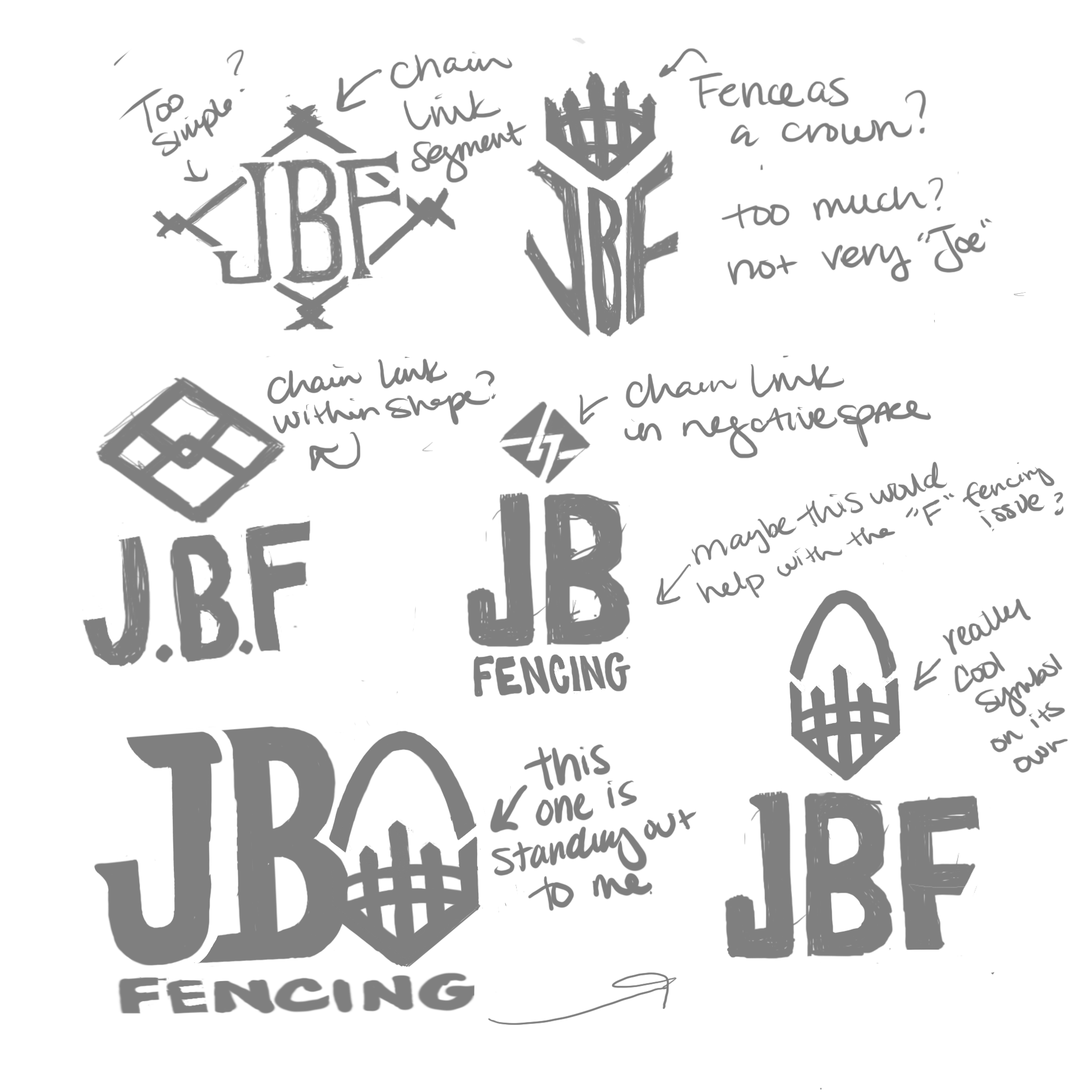
The client emphasized the importance of highlighting “JBF” as the primary visual element, with the full business name taking a more supportive role. From the start, I knew the monogram had to stand strong on its own—instantly recognizable and clean, even without the full name alongside it.
I set out to create a mark that subtly nodded to the fencing industry without leaning too literally into the concept. Early explorations included a fence-inspired crown, a stylized chain link, and a clever integration of the St. Louis Arch—a tribute to the company’s proud local roots.

While the initial concepts had potential, they lacked the bold, commercial edge the brand needed. I took a step back and refined the direction—introducing a simplified, more approachable design that incorporated a chain link within a diamond shape. It was clean and functional, but creatively, it felt a bit too safe.
That said, one detail stood out: a vertical fence post subtly placed between the “J” and the “B.” It added just the right amount of industrial grit without overpowering the design. I knew we had something worth exploring further—something that could bring personality and purpose to the monogram in a fresh, unexpected way.

Once inspiration struck, everything started to fall into place. I refined the fence post into a more recognizable, intentional shape and explored it across three distinct layout variations. To bring harmony to the overall design, I customized the typeface—tailoring the letterforms to feel more cohesive and balanced within the mark.
Through testing and feedback, we found that three fence posts felt excessive, while one didn’t carry enough weight. The sweet spot was two—strong, symmetrical, and just right. We also needed to balance the spacing on the post behind the F for symmetry.
At the same time, we revisited the color palette. The original tones leaned a bit too soft and didn’t quite reflect the rugged, commercial nature of the business.


The final logo strikes the perfect balance between function and personality—instantly recognizable, rooted in the industry, and built to scale across everything from job site signage to branded apparel. It not only reflects JB Fence’s reputation for strength and reliability but also positions them confidently within the commercial market. I also incorporated a custom fence pattern to utilize across branding materials. This project was a great reminder that sometimes the smallest details—like a single fence post—can make the biggest impact.
I'm incredibly proud of how this one came together.