B&H Mining & Cattle Co.
Born from a few friends and a shared vision on the farm, B&H Mining & Cattle Co. is a small-scale operation rooted in hard work and heritage. When they came to me, they were looking to refresh their visual identity after an earlier logo fell short of expectations. Their primary need was a versatile design that would translate well to hats and apparel—something clean, bold, and memorable.
I set out to create a mark that not only fit those needs but also captured the spirit of the brand. From sketch to final rendering, this project was a rewarding opportunity to blend hand-drawn illustration with purposeful design. The result is a timeless, rugged identity the client was proud to call their own.
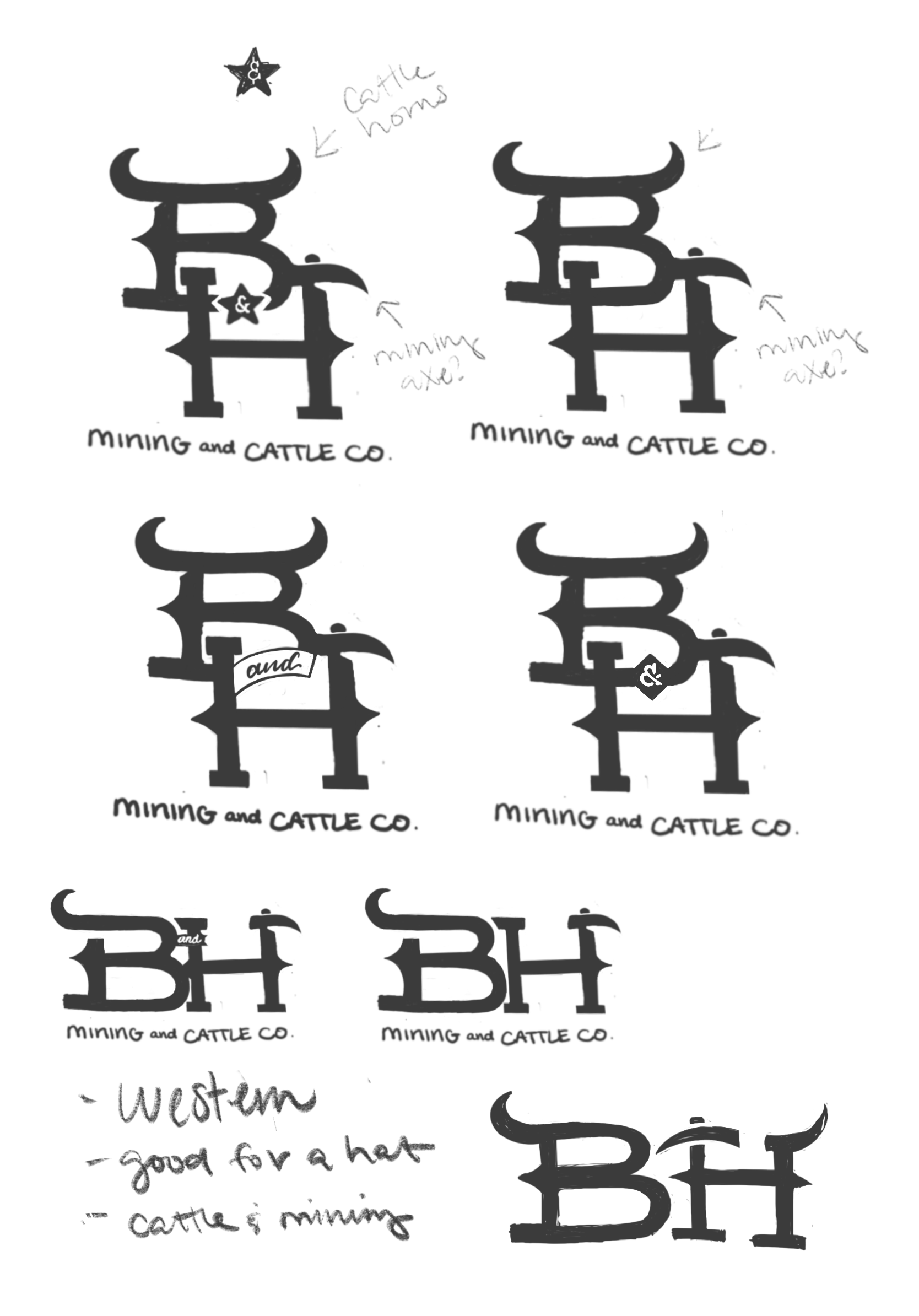
The idea started with the integration of cattle horns into the “B” to instantly convey a Western, ranch-inspired feel. From there, I experimented with incorporating the shape of a mining axe into the crossbar of the “H.”
The horn and axe shapes share a similar curvature and taper, which gives them a nice visual harmony when combined. The goal at this stage is to find a balance between symbolism and legibility—something that could eventually translate well to applications like hat patches, signage, or branding irons.
While the client connected with the original monogram direction, they were especially drawn to the idea of incorporating a more literal bull illustration into the final mark. In response, I developed a bold silhouette of a bull’s head, integrating the mining axe directly into the eyes—a subtle but powerful nod to the brand’s dual focus.
To support the graphic, I designed a custom Western-style type treatment and introduced flowing linework to unify the composition and reinforce the sense of motion and craftsmanship. The color palette—rich cognac leather tones paired with deep brown—was chosen to evoke a rugged, masculine energy while grounding the brand in a timeless, rustic aesthetic.
This ended up being my personal favorite rendering from the project—it brought together storytelling, symbolism, and stylistic cohesion in a way that felt both striking and memorable.
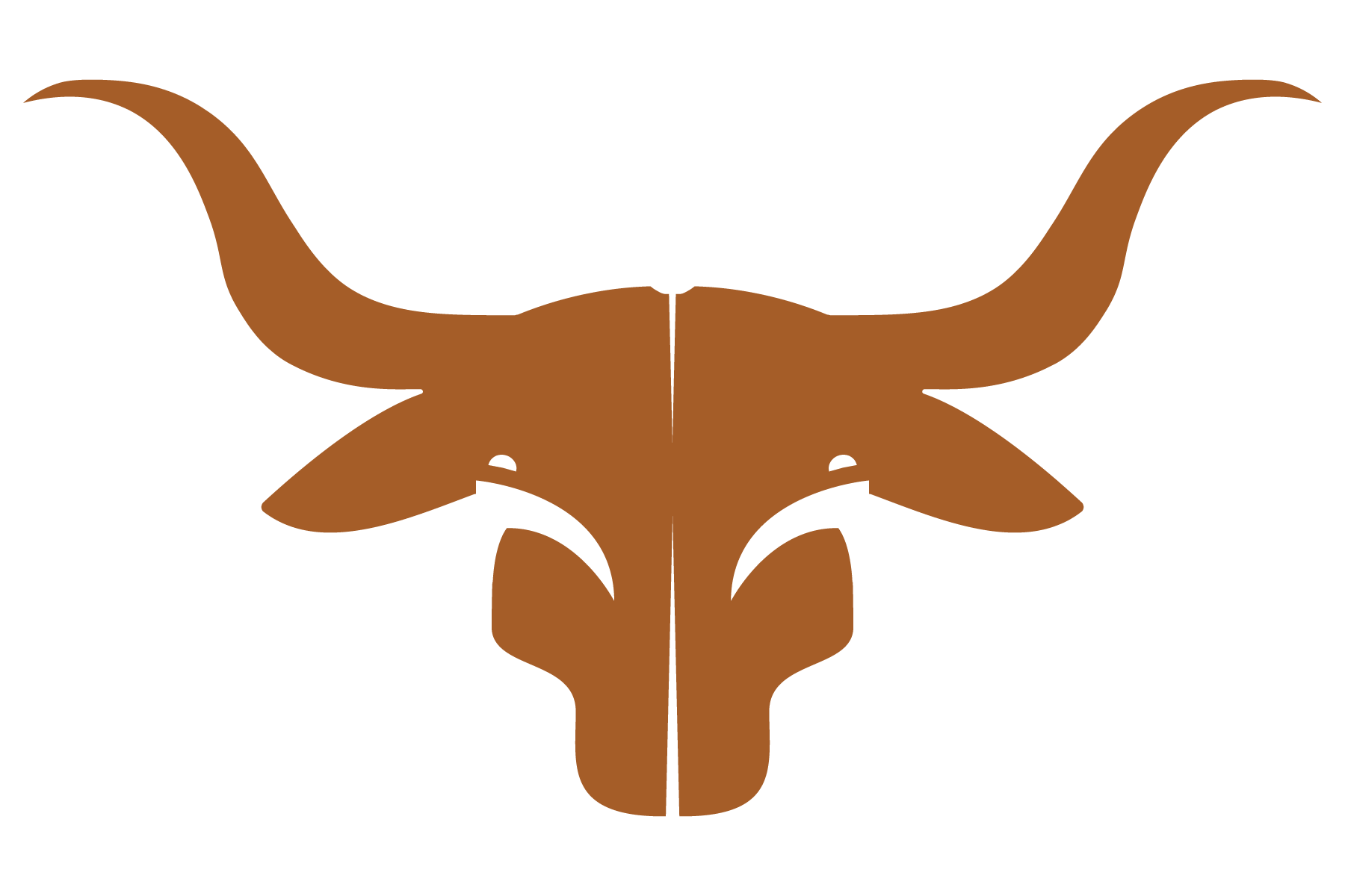

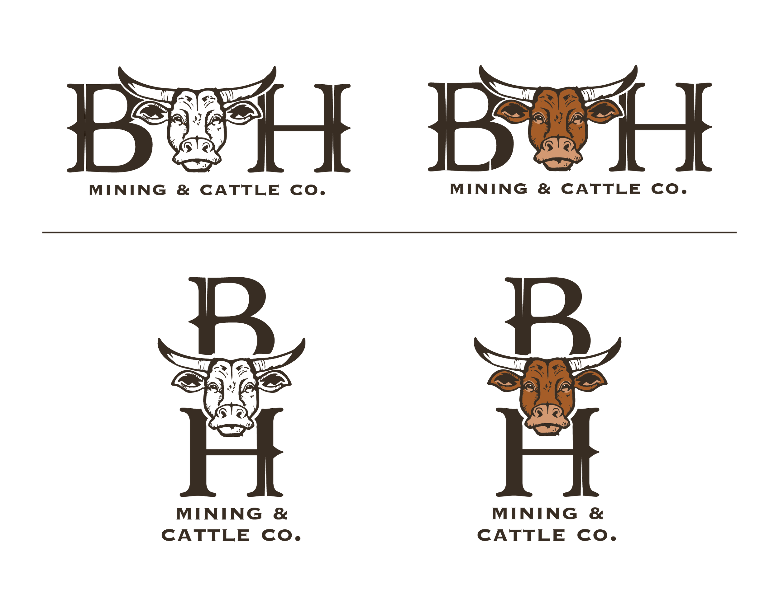
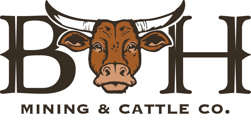
This final concept brings together all the elements the client responded to throughout the development process: a strong Western identity, a handcrafted feel, and a bold, literal representation of the bull.
At the heart of the mark is a custom-sketched bull’s head—detailed enough to feel expressive and hand-rendered, yet clean and structured for consistent use across branding applications. The illustration pairs seamlessly with the bespoke Western-style typography, creating a cohesive and iconic visual system.
To reinforce the brand’s rugged, masculine aesthetic, I selected a warm cognac leather and deep brown color palette—evoking durability, tradition, and a timeless Western spirit. This version brings the identity to life in a way that feels both distinctive and rooted in the heritage of cattle and mining.
